Estudio Furia
Estudio Furia · Version 2.2 · October 2026

Brand manual

01

Cover

Identity, visual system and applications of Estudio Furia.

Ver especificaciones

Estudio Furia brand manual, version 2.2. It brings together the identity, the visual system and its applications. Measurements come from the logotype file and the current website.

02

Principles

Five decisions order everything else.

Ver especificaciones

Five decisions organise everything else. The brand does not shout: the intensity the name suggests lives in the design (large type, firm composition, space), never in the copy.

  • Ink on paper: a single neutral, Ink, on white. Deep graphite, as a gradient with the dot texture, is the moment of greatest presence. There is no brand accent colour.
  • Hierarchy comes from space and line: 1 px rules, air and size. Never shadows, decorative gradients or rounded corners.
  • Two voices, two roles: Minion Pro Display italic speaks (titles, numbers, emphasis). GT Walsheim informs (body, labels, support).
  • Every figure with its source: without platform, period and source it is not published. A figure from one platform is never attributed to another.
  • Less, better: one idea per piece. If an element does not change what the person does or understands, it goes.
03

Logotype and symbol

One logotype and one symbol. Always from the file, never redrawn.

Ver especificaciones

A typographic logotype, solid and legible, with © as the registration mark. The symbol stacks FU over RIA for square formats: avatar, favicon, seal. It is always reproduced from the file; never redrawn or set in another typeface.

04

Construction of the F

A stem module (58 u) and two 49 u arms. Tap the plate to watch it draw itself.

Ver especificaciones

The F is the smallest unit of the system and the basis of the brand grid. It is built from a stem module (58 u) and two arms of 49 u, over a height of 218 u. It shares its top arm with the U: on its own, it is cut at 127.6 u, where the U begins. Tap the plate to watch it draw again.

Height of the F
218 u
Stem (module)
57.9 u
Top arm
48.9 u × 127.6 u
Middle arm
48.9 u, up to 110.8 u
05

Construction of the logotype

Every straight edge extended on the module grid, with measurements from the vector file.

Ver especificaciones

Module grid (F stem, 57.9 u) with every straight edge of the outlines extended. Cap height 218 u; the U overshoots by 6.2 u; the © sits on a 57.2 u ring. Measurements from the vector file.

Full width
798,6 u
Cap height
218 u
U–R gap
16,6 u
© ring
57,2 u
06

Clear space and minimum size

One module (x) of clear space on all four sides. Below the minimum, the © stops reading.

Ver especificaciones

Clear space is one module (x, the thickness of the F's stem) on all four sides. Nothing enters it: no text, no edges, no other logotype. Below the minimum size the © stops being legible.

Clear space
1 module (58 u)
Minimum on screen
72 px wide
Minimum in print
20 mm wide

The minimums are proposed values in this version; they are confirmed with a print proof.

07

Versions

Four versions cover every background. There is no colour version: the brand is ink.

Ver especificaciones

Four versions cover every background. On light paper, a graphite logotype. On deep graphite or Ink, white. The symbol for square formats. There is no colour version: the brand is ink.

08

Incorrect uses

Six common mistakes. All avoided by using the versions in the file.

Ver especificaciones

The logotype is a file, not a drawing to interpret. These six mistakes are the most frequent, and all are avoided with the versions on the previous plate.

09

Colour

One neutral, Ink, on paper. Never pure black. The only colour is the green of the Google 5.0 signal.

Ver especificaciones

One neutral, Ink, on paper. Deep graphite is the moment of greatest presence; pure black is never used. There is no brand accent colour; the only colour is the green signal of the 5.0 Google rating, and only there.

ColourHEXRGBCMYK ref.Pantone ref.UseContrast
Ink#2B2C2E43 · 44 · 467 · 4 · 0 · 82426 CText, titles and brand13.98 : 1 on white
Deep graphite#23242735 · 36 · 3910 · 8 · 0 · 85426 CDark backgrounds: hero and closings, always as a gradient with the dot texture15.52 : 1 with white text
Paper#FFFFFF255 · 255 · 2550 · 0 · 0 · 0No ink (paper)Main backgroundBase
Subtle paper#FAFAFA250 · 250 · 2500 · 0 · 0 · 2No ink (paper)Alternating bands13.39 : 1 with Ink
Tile#F5F5F5245 · 245 · 2450 · 0 · 0 · 4No ink (paper)Brand tiles and chips5.86 : 1 with Soft Ink
Soft Ink#5F5F5F95 · 95 · 950 · 0 · 0 · 63Cool Gray 10 CSecondary text6.39 : 1 on white
Rule#E6E6E6230 · 230 · 2300 · 0 · 0 · 10Cool Gray 1 C1 px lines and bordersDecorative
Google signal#18803824 · 128 · 5681 · 0 · 56 · 50356 C (screen only)Only the 5.0 Google rating5.02 : 1 on white

CMYK ref.: mathematical conversion from RGB, indicative only. The press value depends on the paper's ICC profile (e.g. FOGRA39) and is fixed with a print proof. Pantone ref.: closest Solid Coated equivalent by colour distance (CIELAB) on public third-party values, since Pantone does not publish official HEX values. Indicative: confirm with the Pantone Formula Guide Coated swatch book and a print proof.

10

Typography

Minion italic speaks; GT Walsheim informs, only in Thin or Light.

Ver especificaciones

Two voices, two roles. Minion Pro Display italic 400, in capitals, speaks: titles, numbers and emphasis. GT Walsheim informs, in Thin (100) or Light (300); inside a paragraph, the editorial bold is Regular (400) and never heavier.

11

Hierarchy

Four levels: eyebrow, title, lead and button.

Ver especificaciones

Four levels are enough: eyebrow, title, subhead and button. The title carries the force; the subhead, the fact; the button, a single action.

LevelSize / line height (px)TypefaceUse
Display72 / 72Minion italic 400, capitalsHero. Tracking .02em
H156 / 60Minion italic 400, capitalsPage title
H240 / 43Minion italic 400, capitalsSection title. Tracking .03em
H320 / 23Minion italic 400, capitalsItem or card
Numeral32 / 32Minion italic 400Indexes and verified figures
Lead20 / 31Walsheim Thin 100Subhead on a high-contrast background
Body16 / 27Walsheim Light 300Paragraph
Body S14 / 23Walsheim Light 300Card subheads and specifications
Eyebrow11 / 16Walsheim Light 300, capitalsTracking .3em
Caption10 / 14Walsheim Light 300, capitalsTracking .16em. Source of figures
Button13 / 16Walsheim Light 300, capitalsTracking .18em
12

Grid and space

Twelve columns, a scale from 8 to 112 px and at least two columns on mobile.

Ver especificaciones

Twelve columns on desktop. Space is the main hierarchy tool: the scale runs from 8 to 112 px and intermediate values are not improvised. On mobile, card grids keep at least two columns.

  • 18Minimum between inline elements
  • 216Control padding; gap between 2×N cards on mobile
  • 324Side margin on mobile
  • 440Index column gap
  • 556Column gap on desktop
  • 680Section vertical padding on mobile
  • 7112Section vertical padding on desktop
13

Iconography

The number and the plane replace the icon. Flat SVG, sharp corners, never emoji.
Ver especificaciones

The number and the plan replace the icon. When it is essential: flat SVG with solid fill, sharp corners, no stroke, no gradient and no volume. Never emoji, never childish or three-dimensional icons.

14

Stationery

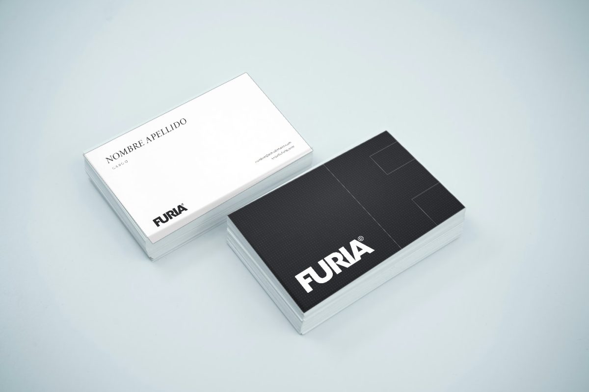
Ink on paper: graphite logotype on white, or white on graphite.

Ver especificaciones

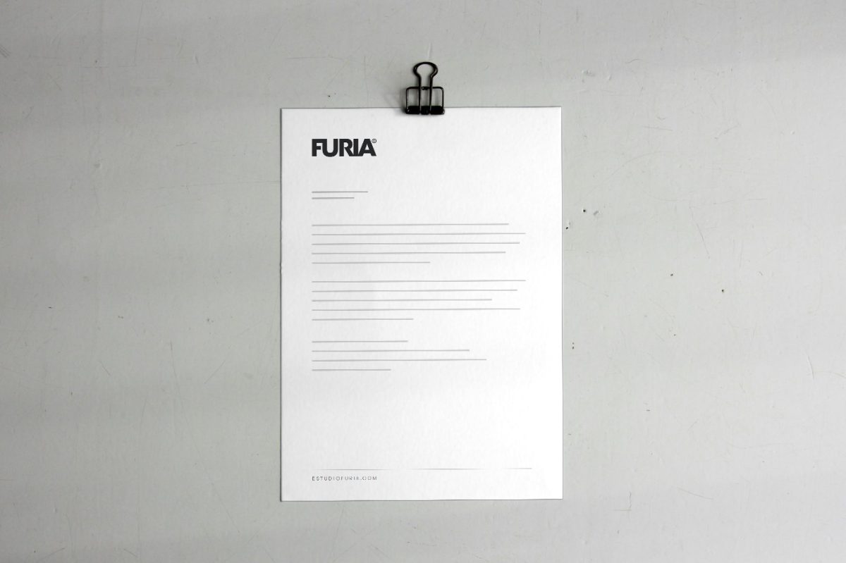
Ink stationery, with no finishes that imitate another brand. Pieces: A4 letterhead, DL envelope, 85 × 55 mm card and A4 folder. System mockups: the texts are placeholders, not real data.

15

Social media

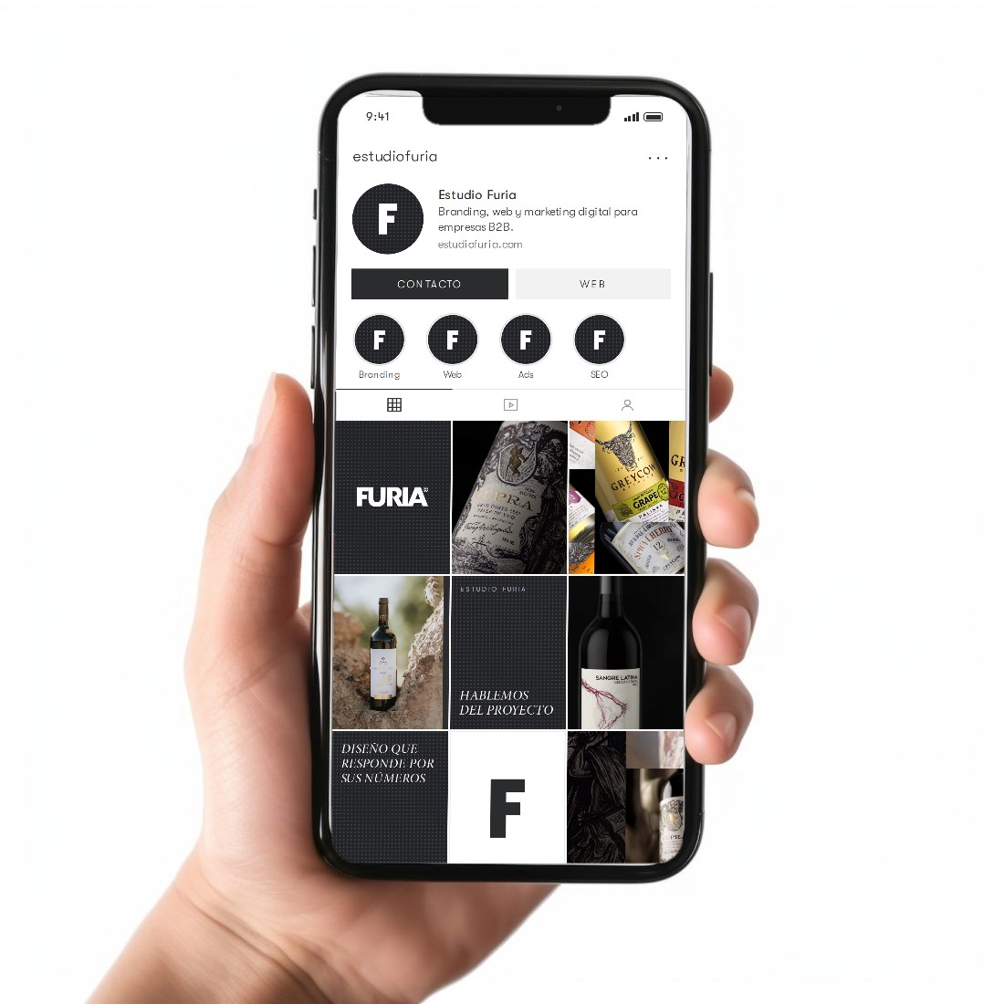
One profile, one logotype angle, and photography only from real work.

Ver especificaciones

One idea per piece. Headline in Minion italic capitals, the logotype always at the same angle, and photography only from real work. 4:5 feed format. System mockup, not scheduled posts.

16

LinkedIn and stories

4:1 banner, posts and four 9:16 stories.
Ver especificaciones

LinkedIn is the main B2B network: 4:1 banner with the logotype and the services description, avatar with the symbol and posts with one idea per piece. 9:16 stories with a Minion italic capitals headline. System mockups, not scheduled posts.

17

Outdoor and signage

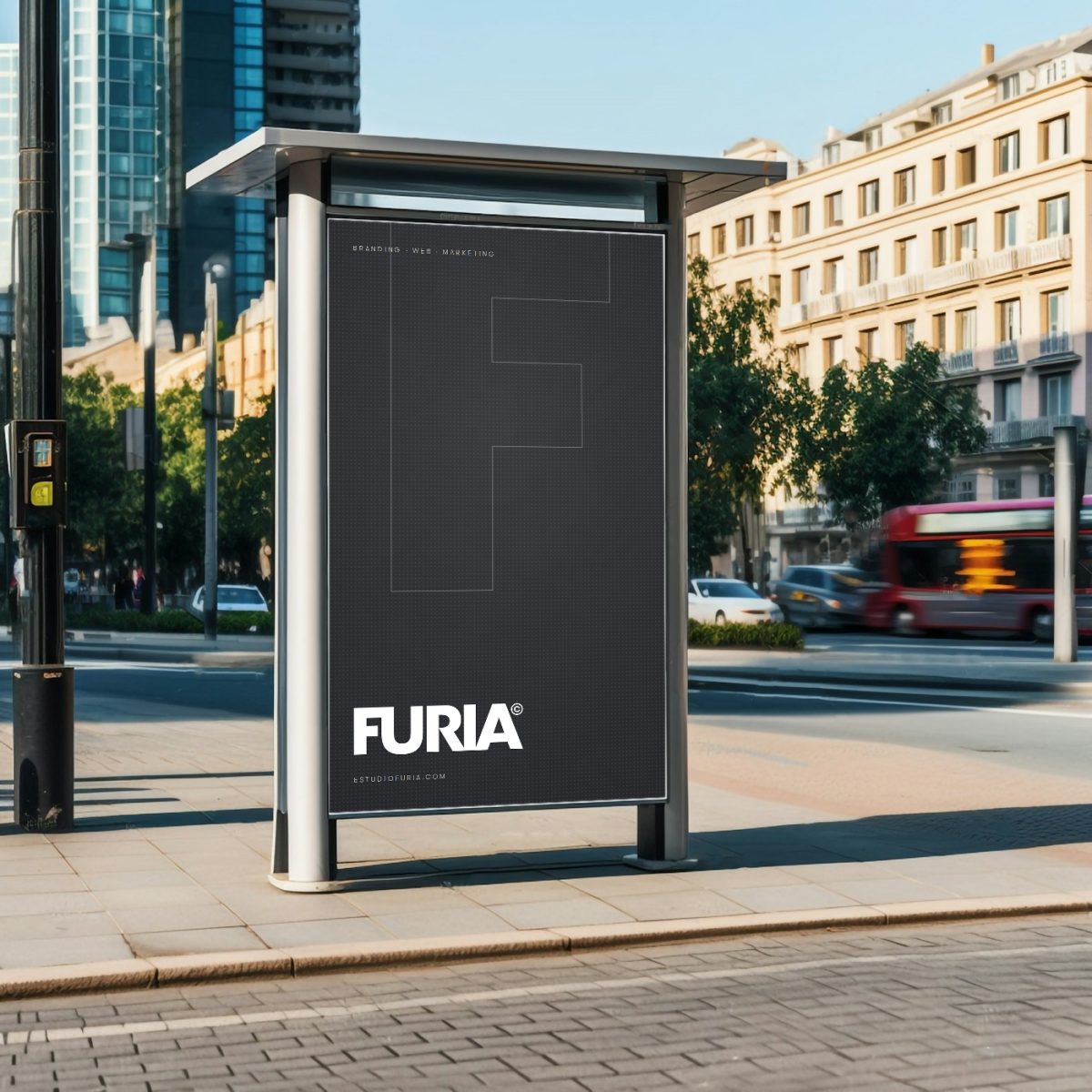
One idea at a distance: logotype, F and web address.
Ver especificaciones

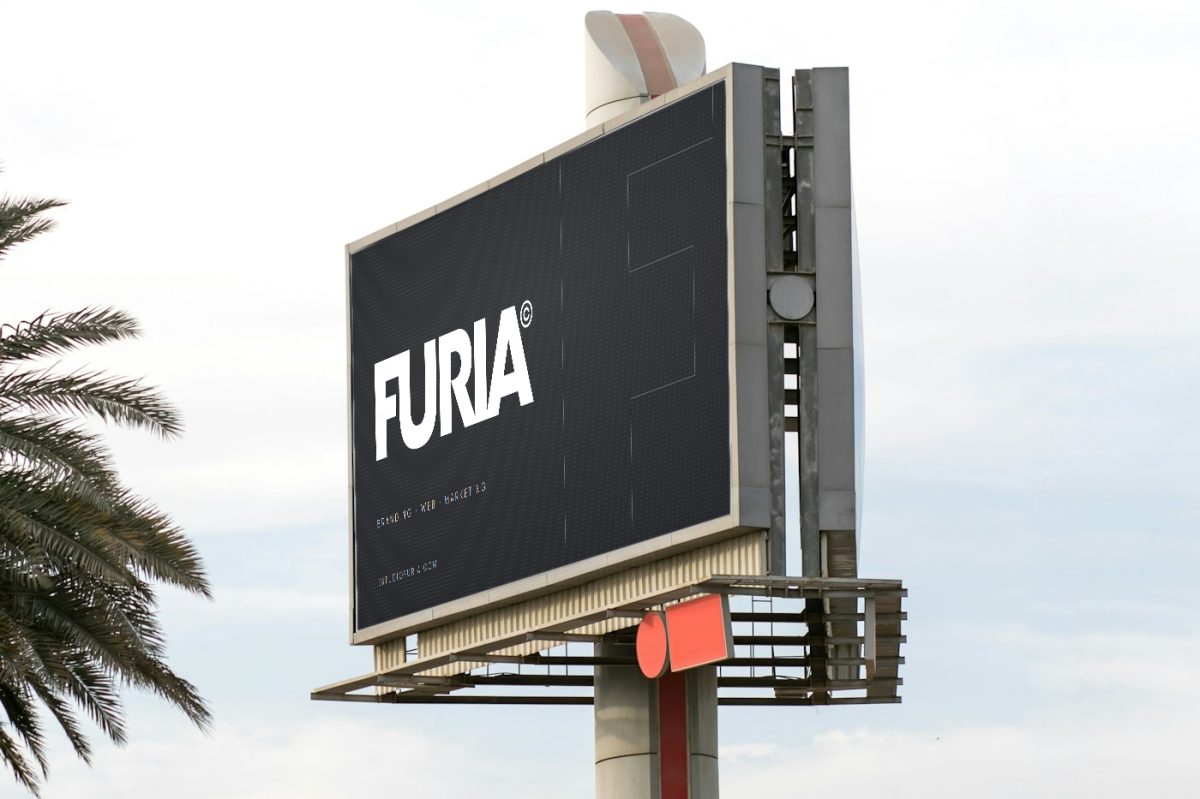
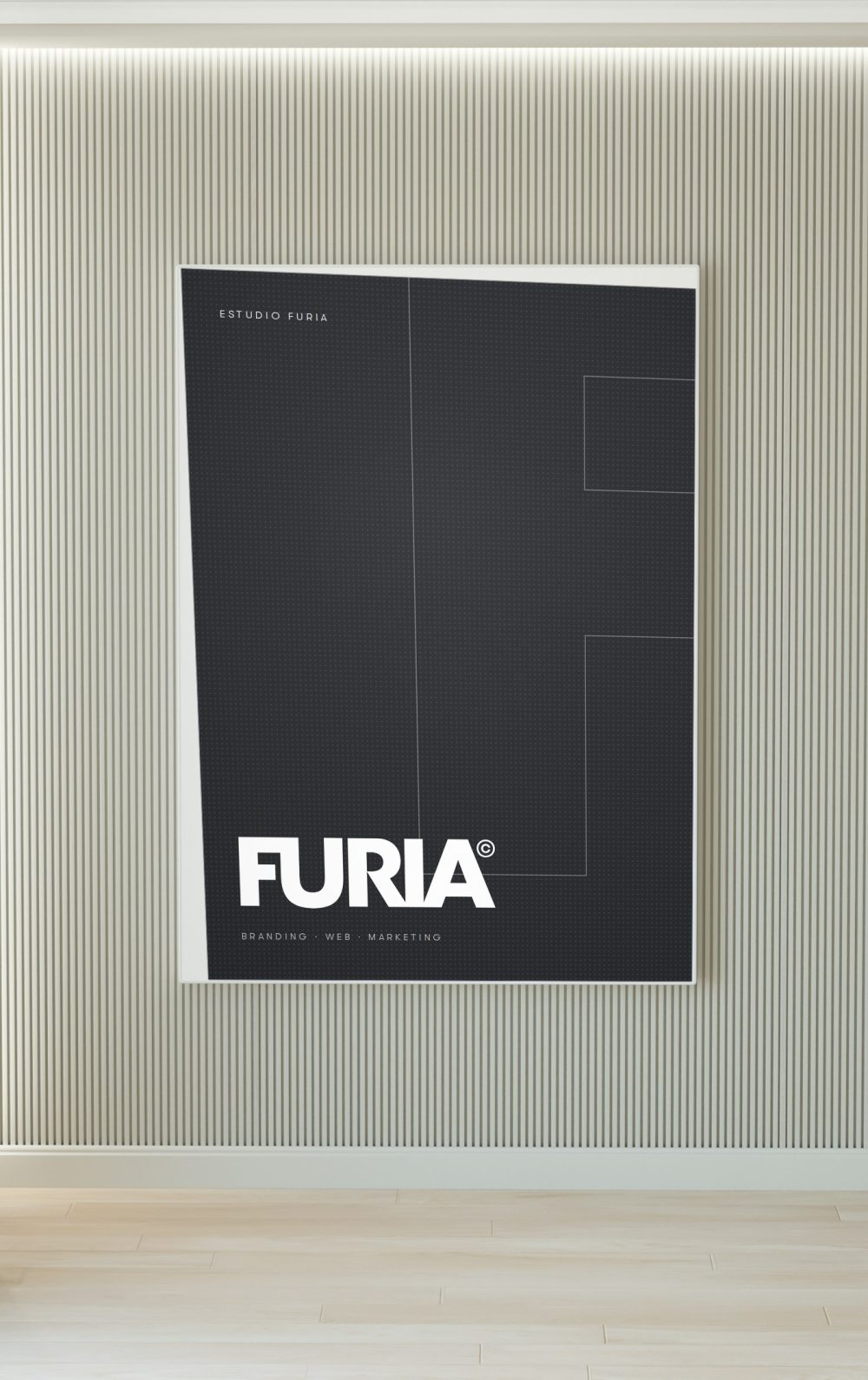
At a distance, contrast rules: white logotype on graphite with the F in outline, and the web address as the only data. Mockups on free-licence photographs; the designs are system mockups, not commissioned pieces.

18

Merchandising

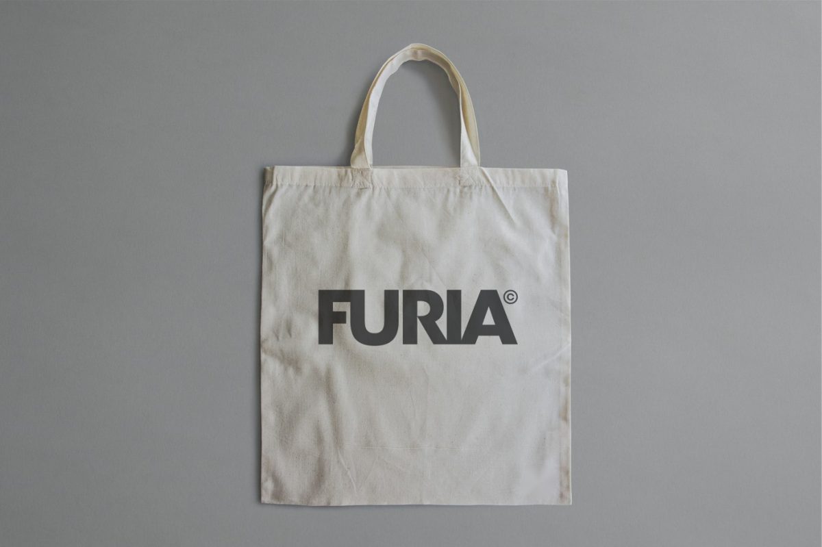
The logotype in graphite on raw cotton, no colour, no ornament.
Ver especificaciones

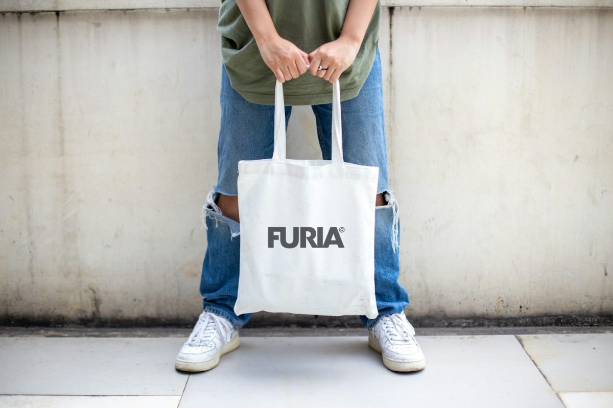
A single ink colour. The logotype respects the clear space and is never cropped against the piece's edges. Mockups on free-licence photographs; system mockups, not produced pieces.

19

Digital

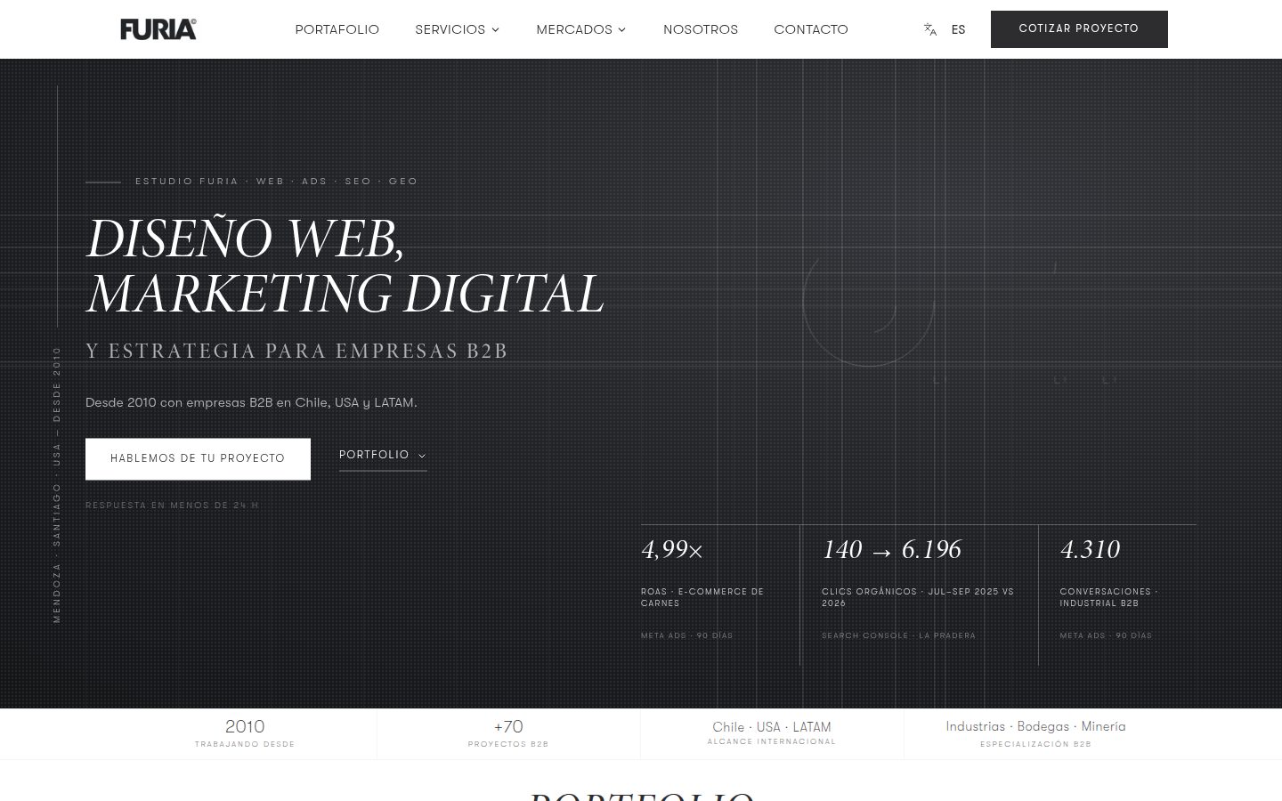
The website is the brand's main piece. Real captures, October 2026.

Ver especificaciones

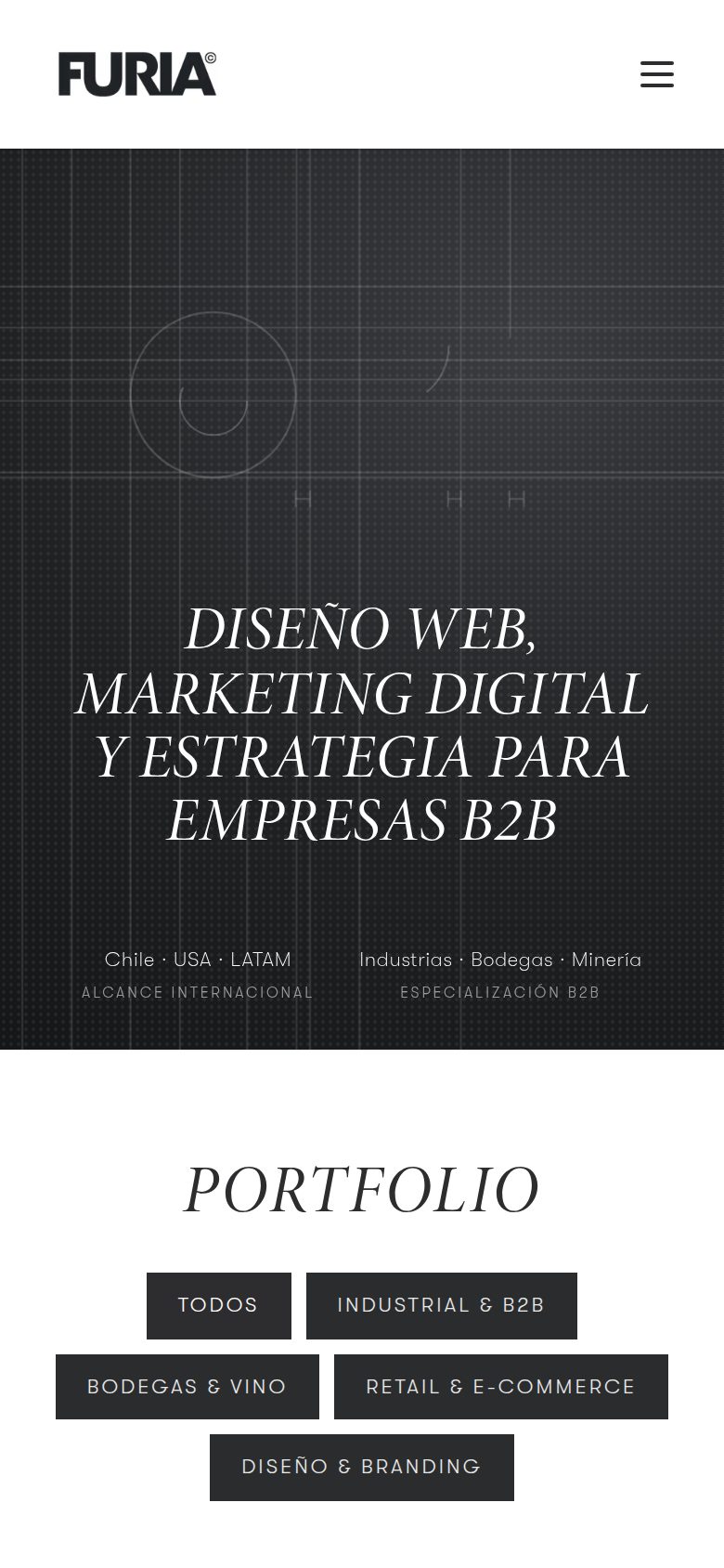
The website is the brand's main piece: deep graphite in the hero with the logotype construction behind it, white paper everywhere else, 1 px rules and large type. Real captures of estudiofuria.com, October 2026.

20

Real pieces

Five projects published in the portfolio, with their type of work.

Ver especificaciones

The system is judged on published work. Five portfolio projects, with the type of work as listed on estudiofuria.com: brand, e-commerce and website. Images from the projects themselves, without stock photography or figures.

21

Commercial documents

Graphite cover, white interior, figures with their source.

Ver especificaciones

Proposals, quotes and presentations use the same ink: graphite cover, white interior, figures with sources and the promised response always the same: under 24 hours. System mockup; the grey lines are placeholder text.

22

Voice

The brand informs, it does not shout. Every figure carries platform, period and source.

Ver especificaciones

The brand informs, it does not shout. Every figure carries platform, period and source. Response, proposal and quote: always under 24 hours. No public prices: every project is quoted to scope, in writing. No emojis on the site.

23

Motion

A single 6.4 s pass. With “reduce motion”, the drawing appears finished.

Ver especificaciones

Motion draws, it does not decorate: a single pass of about 6 seconds (grid, guides, outline, fill, dimensions) that restarts only when it re-enters the screen. Only transform, opacity and stroke-dashoffset are animated, never measurements, to avoid layout shifts. With “reduce motion” enabled, the drawing appears already finished.

24

Closing

Version 2.2 · October 2026. If the site and the manual differ, the manual is corrected.

Ver especificaciones

Version 2.2, October 2026. Changes are approved by Estudio Furia's Direction; an approved decision is not withdrawn because a newer reference appears: it is reviewed and recorded. If the site and the manual differ, the manual is corrected.

Status of this version

  • Reference CMYK on the colour plate (indicative). Pantone ref.: closest Solid Coated equivalent (indicative; confirm with a physical swatch book).
  • Minimum print size (20 mm): proposed value, no physical proof yet.
  • Stationery, social and documents: system mockups with placeholder text; they are not approved pieces for print or publication.
  • Spanish version of the manual: /manual-de-marca.

Technical annex

Ink#2B2C2E43 · 44 · 46Pantone 426 CText, titles and brand13.98 : 1 on white
Deep graphite#23242735 · 36 · 39Pantone 426 CDark backgrounds: hero and closings, always as a gradient with the dot texture15.52 : 1 with white text
Paper#FFFFFF255 · 255 · 255No ink (paper)Main backgroundBase
Subtle paper#FAFAFA250 · 250 · 250No ink (paper)Alternating bands13.39 : 1 with Ink
Tile#F5F5F5245 · 245 · 245No ink (paper)Brand tiles and chips5.86 : 1 with Soft Ink
Soft Ink#5F5F5F95 · 95 · 95Pantone Cool Gray 10 CSecondary text6.39 : 1 on white
Rule#E6E6E6230 · 230 · 230Pantone Cool Gray 1 C1 px lines and bordersDecorative
Google signal#18803824 · 128 · 56Pantone 356 C (solo pantalla)Only the 5.0 Google rating5.02 : 1 on white
Display72 / 72Minion italic 400, capitalsHero. Tracking .02em
H156 / 60Minion italic 400, capitalsPage title
H240 / 43Minion italic 400, capitalsSection title. Tracking .03em
H320 / 23Minion italic 400, capitalsItem or card
Numeral32 / 32Minion italic 400Indexes and verified figures
Lead20 / 31Walsheim Thin 100Subhead on a high-contrast background
Body16 / 27Walsheim Light 300Paragraph
Body S14 / 23Walsheim Light 300Card subheads and specifications
Eyebrow11 / 16Walsheim Light 300, capitalsTracking .3em
Caption10 / 14Walsheim Light 300, capitalsTracking .16em. Source of figures
Button13 / 16Walsheim Light 300, capitalsTracking .18em

Space scale (px): 8 · 16 · 24 · 40 · 56 · 80 · 112. Reference CMYK (mathematical conversion) and reference Pantone: fixed with a print proof. Minimum print size 20 mm: proposed value.

Step 1 / 6Estudio Furia

Contact

Tell us about your project

Answer a few quick questions and we'll guide you with a tailored proposal.

Prefer to write directly? hey@estudiofuria.com · Reply within 24 h